

Enlighten Robotics was founded in direct response to the Coronavirus pandemic. In April 2020, they designed a robot that can disinfect pretty much anywhere that needs it using UVC lighting. Their current goal is to operate fleets of robots, assisting in the robots navigation as well as multiple robots at once. The software will also serve as a dashboard providing the operator with features such as data visualization, fleet management, and job selection.


The Enlighten Robotics operators cannot properly control and run the disinfection process because they are currently using a third-party platform that limits the operator’s ability to successfully complete their job and there to their goals in three ways:


If the operators have their own in-house platform with features such as wayfinding in the form of a facility map, the ability for each operator to control multiple robots, and implementing visibility of status in the form of live progress data, they will be able to control the robots and run the disinfection process while also collecting data that will be used to generate reports. As seen above, these low fidelity wireframes depict the new proposed platforms features:
I was in charge of designing the control board as well as the research behind it. The obstacle here was that there are currently no competitors providing a platform that operates the way Enlighten Robotics wants a robotic system to operate. There is autonomous robots in Europe using UVC disinfection and man-operated UVC but not something controlled remotely. Knowing, that I had to look elsewhere. In a discussion with the CEO and CTO of Enlighten Robotics, they imagined their platform


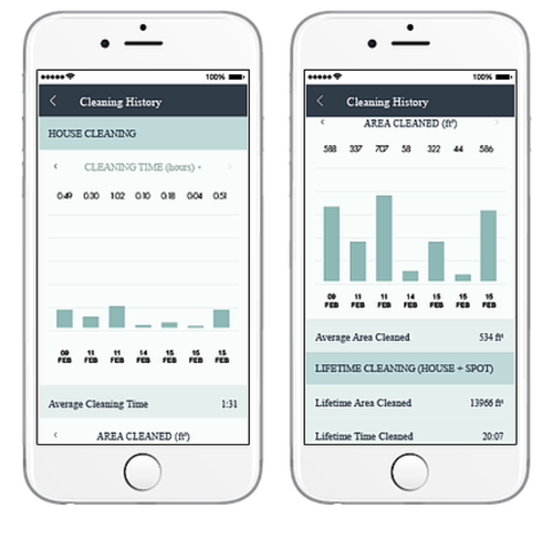
Since there are virtually no direct competitors whom we could model off of, we had to improvise. We thought by looking at something with a control pad or joystick could prove useful, such as the home vacuum robot called Neato. Unlike some vacuums, users are able to control their robots from their phone; they can do it from anywhere.

The current platform seemed a bit outdated in terms of its functionality. The screen on the middle right-hand panel is the entire view of what the robot sees. That's going to be a problem. Since Enlighten Robotics needed something more modern. By having the entire view of the robot’s feed should take up the entire screen with all the functionalities and important data is in overlay.
I used the gaming industry and drone software to back me up on my design decisions. They might be entirely different platforms but you might notice some features that they have in common:


We performed one round of usability tests. All of the users were able to complete each task successfully. However, the targeted time I wanted them to finish it was a bit behind. There was one particular reason that took them so long; they were not sure that the queue in the top center of the screen in the photo above was clickable. You'll notice at the top of the screen there are two radio buttons that signify what robot the user is operating. We added those in to make it more clearer that it is indeed clickable.
One of the most important things for the operator, according to the CEO, is being able to communicate with the custodial staff. This is because the custodian brings out the robot to it's respected cleaning location, and Therefore we added that feature in to the top right corner of the screen. Since the operator is not expected to work on site then the line of communication between the operator and the custodian.
The industry Enlighten Robotics is tapping into is very niche and also new which means there is not a lot of research to cover. We had to go off of our assumptions which could be stressful especially when you are new to the industry. We couldn’t conduct a survey or do user interviews because there are virtually no users to interview.